Chart Makeovers

True beauty comes from within.
Published

September 27, 2024

Introduction

I like to give makeovers to ugly and/or ineffective data visualizations I encounter as a way to keep my data graphic design skills sharp. This page serves to collect and showcase the results.

Education & Parenthood

A reliable way to remake an ineffective data visualization is to apply some of the ideas from Cole Nussbaumer Knaflic’s excellent introductory data visualization book Storytelling with Data. In it, she describes a variety of ways to eliminate clutter that doesn’t help communicate the graphic’s “big idea” and highlight the elements that do.

Original

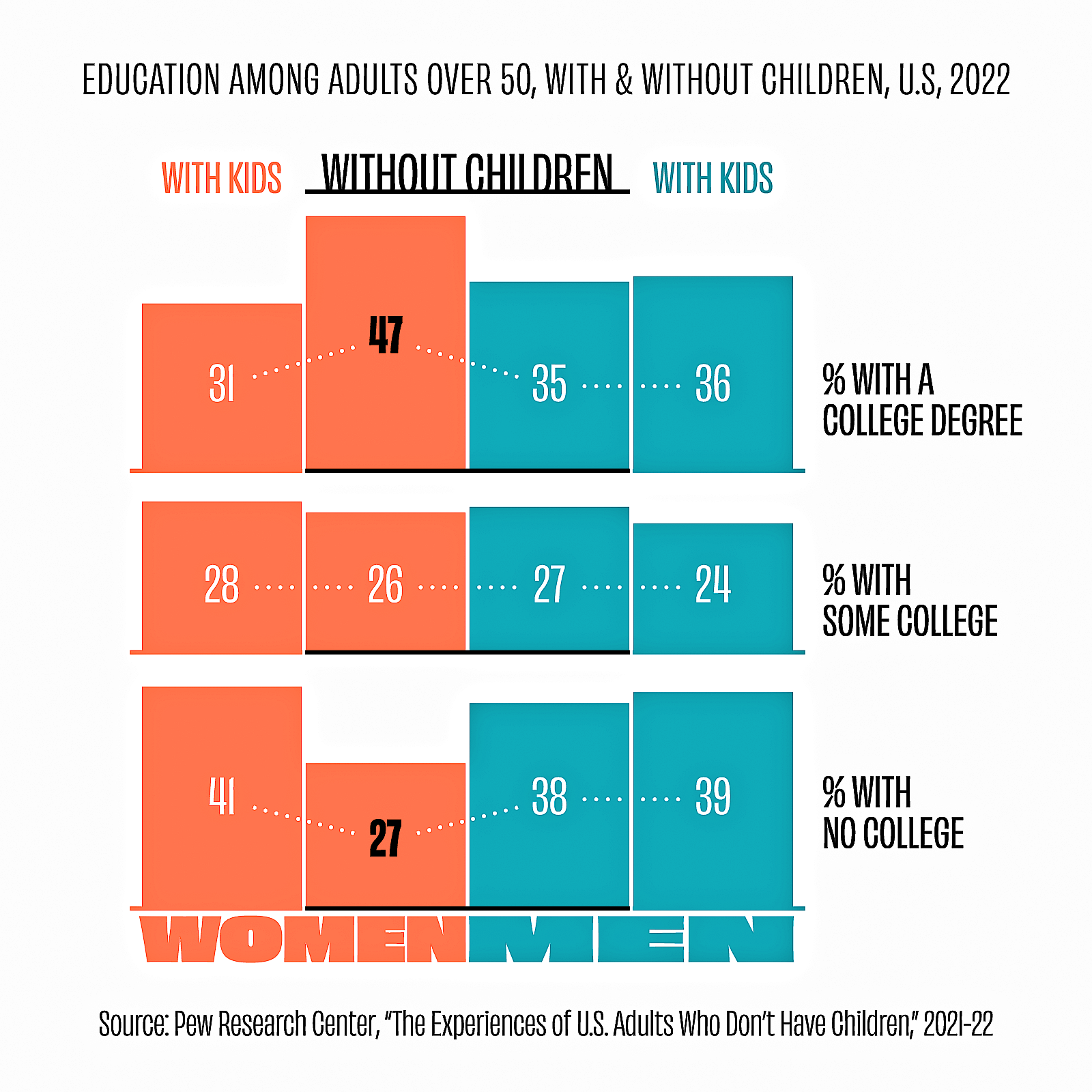
This chart isn’t terrible. The big idea is clear: a larger proportion of childless women have college degrees than do mothers, fathers, or childless men. The column heights and label colours show this well enough. But the chart is a bit confusing. The columns are arranged so that childless women and men are adjacent, but this order isn’t very natural, and the combined “WITH KIDS WITHOUT CHILDREN WITH KIDS” header is baffling at first. Additionally, the dotted lines joining the labels strongly imply a time dimension, which these data don’t have.

Makeover

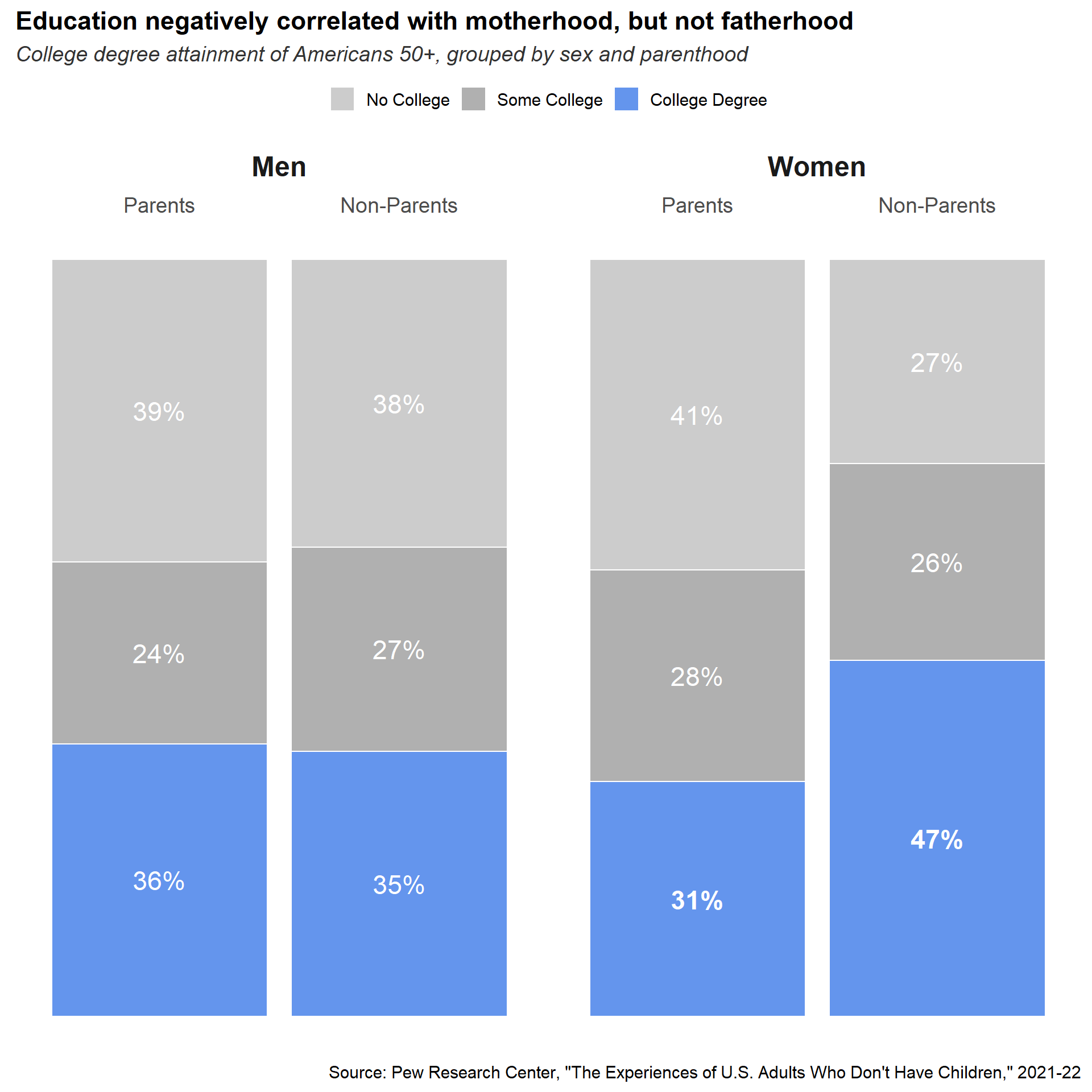
In each of the four combinations of sex and parenthood our values sum to 100%, so a 100% stacked column chart is the natural structure for this graphic. While it could be possible to get the original column order to work by making careful use of borders and/or spacing, the simple solution is to just to facet the plot by sex and place the columns for parents and non-parents in consistent positions within each facet. We’ll also replace the confusing column header with straightforward labels and organize them using a size hierarchy. Instead of mapping fill colour to sex, we’ll use saturation to indicate education levels and hue to highlight the important part. Bolding the most relevant numbers will reinforce that highlighting. The “big idea” will go directly in the title, while the subtitle and caption can explain the structure of the chart and the source of the data.

Our finished makeover also improves somewhat on Pew Research’s own version of the chart, which maps hue to sex and breaks up the column label hierarchy. Their title is excessively wordy, too.

Code
tibble(
  sex       = rep(c("Men", "Women"), each = 6),
  children  = rep(c("Parents", "Non-Parents"), times = 6),
  education = rep(c("College Degree", "No College", "Some College"), 2, NA, 2),
  percent   = c(36, 35, 40, 38, 24, 27, 31, 47, 41, 27, 28, 26),
  label     = str_c(c(36, 35, 39, 38, 24, 27, 31, 47, 41, 27, 28, 26), "%"),
  fontface  = c(rep("plain", 6), rep("bold", 2), rep("plain", 4))) |>
  mutate(
    education = fct_relevel(education, "No College", "Some College"),
    children  = fct_relevel(children, "Parents")) |>
  ggplot() + 
  aes(
    x        = children, 
    fill     = education, 
    y        = percent, 
    label    = label, 
    fontface = fontface) +
  geom_col(position = position_stack(), colour = "white") +
  geom_text(
    aes(group = interaction(sex, education)), 
    size = 6, 
    colour = "white", 
    position = position_stack(vjust = 0.5)) +
  scale_x_discrete(position = "top") +
  scale_fill_manual(
    values = c(
      "No College" = "grey80",
      "Some College" = "grey69", # saturation midpoint
      "College Degree" = "cornflowerblue")) +
  facet_grid(cols = vars(sex)) +
  labs(
    title = "Education negatively correlated with motherhood, but not fatherhood",
    subtitle = "College degree attainment of Americans 50+, grouped by sex and parenthood",
    caption = "Source: Pew Research Center, \"The Experiences of U.S. Adults Who Don't Have Children,\" 2021-22") +
  theme_minimal(base_size = 14) +
  theme(
    axis.title      = element_blank(),
    axis.text       = element_text(size = 14),
    axis.text.y     = element_blank(),
    legend.title    = element_blank(),
    legend.position = "top",
    panel.grid      = element_blank(),
    plot.title      = element_text(face = "bold"),
    plot.subtitle   = element_text(face = "italic", colour = "grey20"),
    strip.placement = "outside",
    strip.text      = element_text(size = 18, face = "bold"))
Original

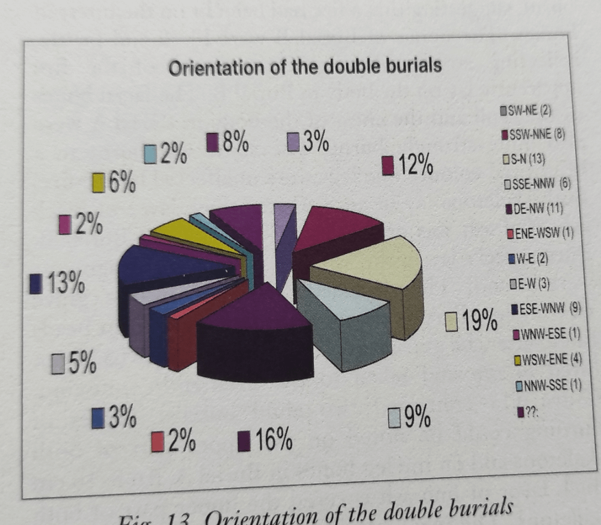
Three-dimensional pie charts are the canonical example of data visualization incompetance. Sadly, The Copper Age Cemetery of Budakalász, an extremely detailed archaeological study of ancient graves found at a site near Budapest, is chock full of them. This one comes from a section about graves containing the remains of two people buried side-by-side. To the authors’ credit, they include tables of all their data, so their data graphics are fully reproducible. They also record many other features of the graves, such as the type of pit and whether it contained any grave goods.

Makeover

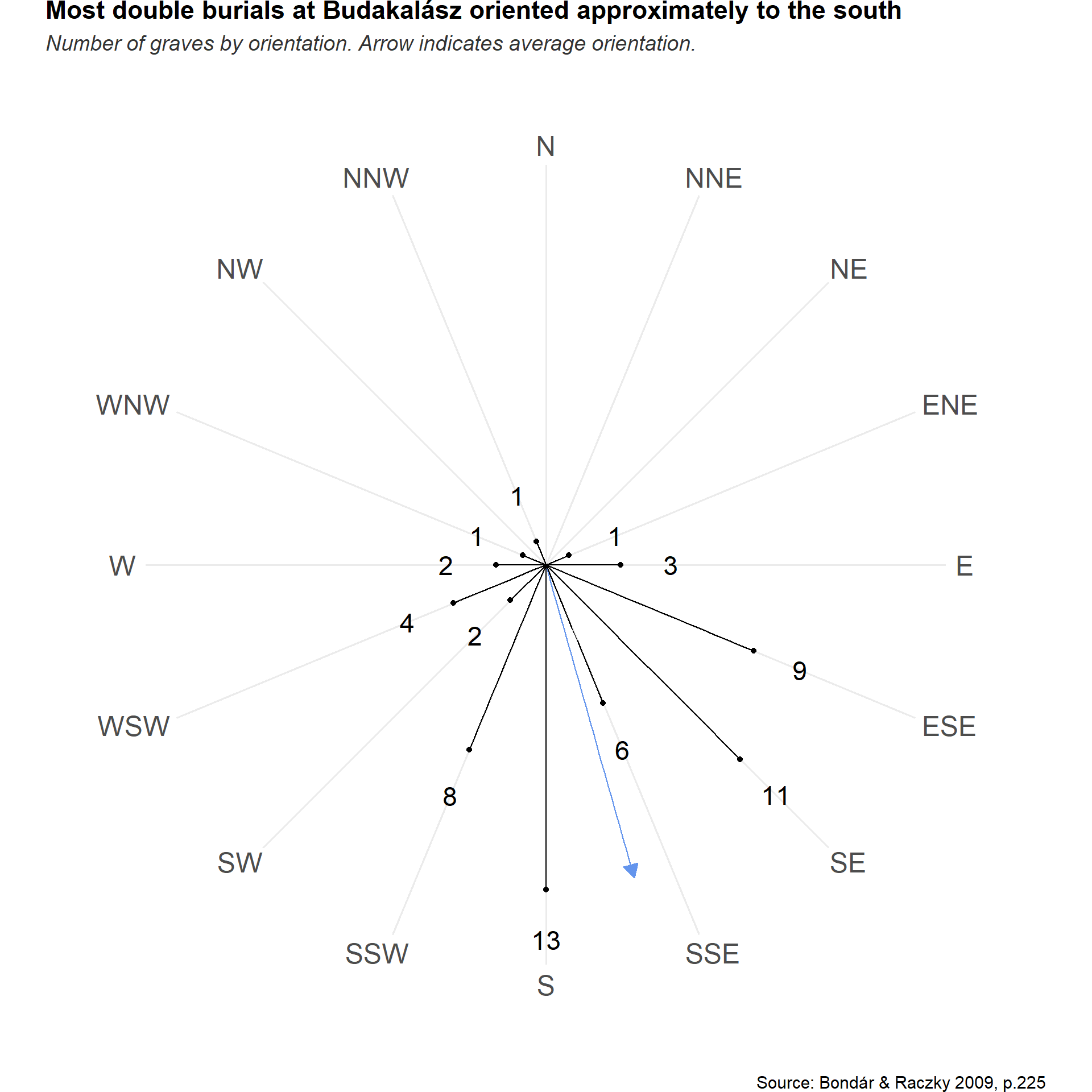
Directional data lends itself well to a radial layout, like a compass. We end up with a lot of whitespace, but this helps reinforce the big idea: “Most burials were oriented to the south, with the head of the deceased aligned to the south or with a slight divergence to the south-east, the south–south-west or the east–south-east”. We can do a little math to calculate the average direction and display that as well.

Code
tibble(
  direction = fct_inorder(
    factor(
      c("N", "NNE", "NE", "ENE", "E", "ESE", "SE", "SSE", "S", "SSW", "SW", "WSW", "W", "WNW", "NW", "NNW"),
      ordered = TRUE)),
  count = c(NA, NA, NA, 1, 3, 9, 11, 6, 13, 8, 2, 4, 2, 1, NA, 1)) |>
  ggplot() +
  aes(x = direction, y = count) +
  geom_segment(
    x = 8.299883, 
    y = 0, 
    yend = 13, 
    colour = "cornflowerblue",
    arrow = arrow(length = unit(10, "point"), type = "closed")) +
  geom_point() +
  geom_text(aes(label = count, y = count + 2), size = 6) +
  geom_segment(aes(y = 0, yend = count)) +
  scale_y_continuous(limits = c(0, 16)) +
  coord_radial(expand = FALSE, end = 15/8 * pi) +
  labs(
    title = "Most double burials at Budakalász oriented approximately to the south",
    subtitle = "Number of graves by orientation. Arrow indicates average orientation.",
    caption = "Source: Bondár & Raczky 2009, p.225") +
  theme_minimal(base_size = 14) +
  theme(
plot.margin=unit(c(0,-4,0,-4),"cm"),
    axis.text.r = element_blank(),
    axis.title = element_blank(),
    axis.text.theta = element_text(size = 18),
    panel.grid.minor.x = element_blank(),
    panel.grid.major.y = element_blank(),
    panel.grid.minor.y = element_blank(), 
    plot.title      = element_text(face = "bold"),
    plot.subtitle   = element_text(face = "italic", colour = "grey20"))