"https://iridl.ldeo.columbia.edu/SOURCES/.CDIAC/.USHCN/.daily/tmax/tmax/[T]data.tsv" |>
  url() |>
  read_tsv() |>
write_tsv(file = "tmax.gz") Hot Days
Original Graphic
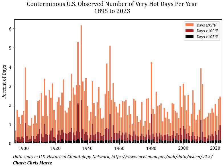
Our goal is to recreate the graphic below, originally posted by Chris Martz on X. He says,
This plot shows the average number of days per year with daily maximum temperatures ≥95°, ≥100° and ≥105° per USHCN station since 1895. The trend is down.
Data Visualization Reproducibility
Reproducibility refers to a set of practices which ensure that a data product can be recreated by someone other than its author(s) in order to verify it. This concept applies as well to data visualization as it does to statistical analyses and machine learning models. A reproducible data graphic allows its audience to verify that the story it tells is truthful.
Unfortunately, the graphic above is not very reproducible. That’s because it’s unclear exactly how it was created and thus it’s unclear exactly what it means. It includes a note about the data source, but the provided URL doesn’t link to a specific data set. The graphic doesn’t indicate what software was used to make it, let alone include code we could use to generate an exact copy of it.
We’ll have to do our best to recreate it “by hand”. Before we do, here’s a horror story about reproducibility, excerpted from a letter published in American Psychologist in 1962.:
Last spring a graduate student at Iowa State University required data of a particular kind in order to carry out a study for his master’s thesis. In order to obtain these data he wrote to 37 authors whose journal articles appeared in APA journals between 1959 and 1961. Of these authors, 32 replied. Twenty-one of these reported the data misplaced, lost, or inadvertently destroyed. […] Of the remaining 7 studies [for which the data were provided in a timely manner and without onerous conditions], 3 involved gross errors.
Getting the Data
The closest USHCN data set I was able to find easily is a TSV of daily maximum temperatures for weather stations in the US. First we download it and store it locally. Note that the read_*() and write_*() family of functions from readr can zip and unzip files automatically according to the file extensions.
Next we read the data into a data frame.
"tmax.gz" |>
  read_tsv(na = "-99") ->
  tmax_data

tmax_data |>
  set_names(\(x) str_c("day_", seq_along(x))) |>
  rownames_to_column(var = "station") |>
  pivot_longer(
    cols = starts_with("day_"),
    names_to = "day",
    names_prefix = "day_") |>
  drop_na() |>
  mutate(date = ymd(18490101) + days(day)) ->
  tmax_data
For each year, we need the proportions of days which were 95‒99°F, 100‒104°F, and 105°F or greater.
tmax_data |>
  mutate(year = year(date)) |>
  filter(year > 1894) |>
  select(year, value) |>
  group_by(year) |>
  summarize(
    above_95  = sum(between(value,  95,  99))/n(),
    above_100 = sum(between(value, 100, 104))/n(),
    above_105 = sum(value >= 105)/n()) |>
  pivot_longer(starts_with("above_"), names_to = "temp_threshold") |>
  mutate(
    temp_threshold = fct_relevel(temp_threshold, "above_95", "above_100")) ->
  tmax_data_thresholded
Our Graphic
Code
tmax_data_thresholded |>
  ggplot(aes(x = year, y = value, fill = temp_threshold)) +
  geom_col(position = position_stack(), width = 0.8) +
  scale_x_continuous(
    expand = c(0, 0),
    breaks = seq(1900, 2020, 20),
    labels = as.character(seq(1900, 2020, 20))) +
  scale_y_continuous(
    breaks = seq(0, 0.1, 0.01),
    labels = as.character(0:10),
    expand = c(0, 0)) +
  scale_fill_manual(
    values = c(
      "above_95" = "#fe7b4b",
      "above_100" = "#b02320",
      "above_105" = "#000000"),
    labels = paste0("Days ≥", seq(95, 105, 5), "°F")) +
  labs(
    title = "U.S. Observed Number of Very Hot Days Per Year 1895 to 2014",
    caption = "Data source: U.S. Historical Climatology Network",
    y = "Percent of Station-Days") +
  theme_bw(base_size = 24) +
  theme(
    aspect.ratio = 3/4,
    text = element_text(family = "Tinos"),
    axis.title.x = element_blank(),
    axis.title.y = element_text(margin = margin(t = 0, r = 10, b = 0, l = 0)),
    legend.position = "inside",
    legend.position.inside = c(0.85, 0.8),
    legend.title = element_blank(),
    legend.background = element_rect(fill = NA),
    panel.grid = element_blank())
Remarks
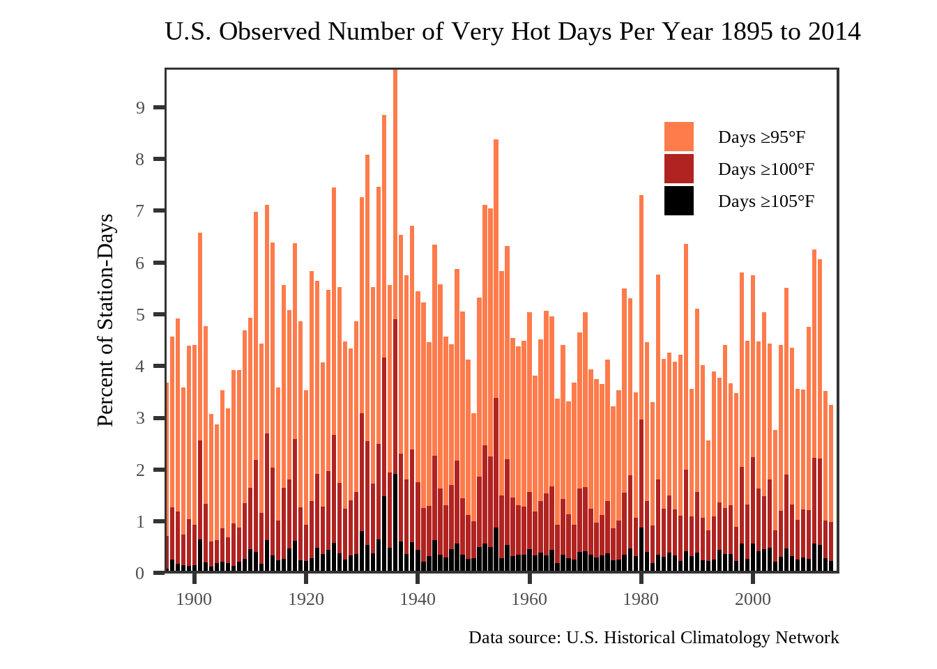
There are some differences between our graphic and the original. For example, the most recent year included in the data we used is 2014, not 2023. Additionally, our vertical axis runs from 0% to 9% of station-days, whereas the original’s is from 0% to 6% of days.1 The original title suggests that data from weather stations in Alaska and Hawaii have been excluded; we have not done this for our graphic.
1 It’s not clear whether or how the original author transformed the data from station-days to days.
2 The linear trend can be added to the graphic with geom_smooth(method = "lm").
While our graphic is not a perfect match for the original, we have nevertheless verified the claim that the (linear) trend in the proportion of very hot days in the United States has been downward since the end of the 19th century, despite the overall increase in the global temperature during that time.2
Context provided by an expert could be important here. A climatologist might be able to tell us whether this linear trend is important or useful, or whether we should try to control for any possible correlation in the changing distribution of American weather stations and average daily maximum temperatures. But one doesn’t need expert knowledge on, or even a basic understanding of, a data graphic’s subject matter in order to benefit from reproducing it. We can be assured that a successfully reproduced graphic isn’t lying, even if we aren’t sure exactly what it’s saying.

